install.packages("devtools")
library(devtools)
install_github("opensdmx/rsdmx", force = TRUE)Shifting Between WEO and IMF themes in R
This tutorial highlights how to shift between two different themes, the WEO theme and the IMF traditional AIV theme.
Set up
We start by loading standard utility scripts that include our access to iData, our themes and custom fonts.
If you have not done the iData section, you will need to install devtools and the rsdmx package to access iData.
Next, you must load several packages packages and also the imf_data_utils script that we created to read iData.
library(rsdmx)
library(AzureAuth)
library(tidyverse)
── Attaching core tidyverse packages ──────────────────────── tidyverse 2.0.0 ──
✔ dplyr 1.1.4 ✔ readr 2.1.5
✔ forcats 1.0.0 ✔ stringr 1.5.1
✔ ggplot2 3.5.1 ✔ tibble 3.2.1
✔ lubridate 1.9.3 ✔ tidyr 1.3.1
✔ purrr 1.0.2
── Conflicts ────────────────────────────────────────── tidyverse_conflicts() ──
✖ dplyr::filter() masks stats::filter()
✖ dplyr::lag() masks stats::lag()
ℹ Use the conflicted package (<http://conflicted.r-lib.org/>) to force all conflicts to become errorslibrary(lubridate)
library(here)here() starts at C:/IMF-R-Booklibrary(patchwork)
library(ggplot2)
source(here("utils/imf_data_utils.R")) Loading the WEO theme
Let’s first start with looking at the WEO theme. Similar to the WEO section, you can load the theme in the following manner. Ensure it is in your Utilities folder.
source(here("utils/theme_and_colors_WEO.R"))
Attaching package: 'gridExtra'The following object is masked from 'package:dplyr':
combineImporting Public WEO data
To start, we will retrieve General Government Revenue (GGR) and real GDP (NGDP_R) data for LA5 countries: Brazil, Chile, Colombia, Mexico, and Peru.
# Download data from WEO database
weo_data <- imfdata_by_countries_and_series(
  department = "RES",
  dataset = "WEO",
  countries = c("BRA", "CHL", "COL", "MEX", "PER"),
  series = c("GGR", "NGDP_R"),
  frequency = "A"
)
[rsdmx][INFO] Fetching 'https://api.imf.org/external/sdmx/2.1/data/IMF.RES,WEO/BRA+CHL+COL+MEX+PER.GGR+NGDP_R.A/all/' # View structure of the data
str(weo_data)'data.frame': 449 obs. of 12 variables:
$ COUNTRY : chr "BRA" "BRA" "BRA" "BRA" ...
$ INDICATOR : chr "GGR" "GGR" "GGR" "GGR" ...
$ FREQUENCY : chr "A" "A" "A" "A" ...
$ LATEST_ACTUAL_ANNUAL_DATA: chr "2023" "2023" "2023" "2023" ...
$ OVERLAP : chr "OL" "OL" "OL" "OL" ...
$ SCALE : chr "9" "9" "9" "9" ...
$ METHODOLOGY : chr "GFS" "GFS" "GFS" "GFS" ...
$ METHODOLOGY_NOTES : chr "Source: Ministry of Finance or Treasury. From 2001 to 2009, Banco Central do Brasil (BCB) fiscal statistics and"| __truncated__ "Source: Ministry of Finance or Treasury. From 2001 to 2009, Banco Central do Brasil (BCB) fiscal statistics and"| __truncated__ "Source: Ministry of Finance or Treasury. From 2001 to 2009, Banco Central do Brasil (BCB) fiscal statistics and"| __truncated__ "Source: Ministry of Finance or Treasury. From 2001 to 2009, Banco Central do Brasil (BCB) fiscal statistics and"| __truncated__ ...
$ TIME_PERIOD : chr "2001" "2002" "2003" "2004" ...
$ OBS_VALUE : chr "478070000000" "600670000000" "616530000000" "718997000000" ...
$ date : num 2001 2002 2003 2004 2005 ...
$ value : num 4.78e+11 6.01e+11 6.17e+11 7.19e+11 8.36e+11 ...Clean and Reshape Data
As we have discussed earlier in the book, it is best to reshape the data to a wide format for easier analysis. Let’s do that now.
# Clean and reshape data
weo_clean <- weo_data %>%
  # Filter relevant columns
  select(COUNTRY, INDICATOR, TIME_PERIOD, OBS_VALUE) %>%
  # Rename columns for better readability
  rename(
    Country = COUNTRY,
    Indicator = INDICATOR,
    Year = TIME_PERIOD,
    Value = OBS_VALUE
  ) %>%
  # Pivot wider to have one column for each indicator
  pivot_wider(names_from = Indicator, values_from = Value)

# Preview the cleaned data
head(weo_clean)
# A tibble: 6 × 4
Country Year GGR NGDP_R
<chr> <chr> <chr> <chr>
1 BRA 2001 478070000000 796023000000
2 BRA 2002 600670000000 820328000000
3 BRA 2003 616530000000 829688000000
4 BRA 2004 718997000000 877477000000
5 BRA 2005 835821000000 905575000000
6 BRA 2006 908227000000 941453000000Basic Data Analysis
For better graphs, let’s quickly also calculate the year-on-year changes to our indicators.
# Convert GGR and NGDP_R to numeric and calculate YoY changes
weo_clean <- weo_clean %>%
  arrange(Country, Year) %>%
  mutate(
    GGR = as.numeric(GGR),
    NGDP_R = as.numeric(NGDP_R)
  ) %>%
  group_by(Country) %>%
  mutate(
    YoY_GGR = (GGR / lag(GGR) - 1) * 100,
    YoY_Real_GDP = (NGDP_R / lag(NGDP_R) - 1) * 100
  ) %>%
  ungroup()

# Preview data with YoY calculations
head(weo_clean)
# A tibble: 6 × 6
Country Year GGR NGDP_R YoY_GGR YoY_Real_GDP
<chr> <chr> <dbl> <dbl> <dbl> <dbl>
1 BRA 1980 NA 522938000000 NA NA
2 BRA 1981 NA 499930000000 NA -4.40
3 BRA 1982 NA 502908000000 NA 0.596
4 BRA 1983 NA 485809000000 NA -3.40
5 BRA 1984 NA 511592000000 NA 5.31
6 BRA 1985 NA 552012000000 NA 7.90 Plotting your Data
Now that our data is clean and analyzed, let’s visualize our year-on-year changes by creating two line charts in our WEO theme, one on real GDP and one on general government revenue, with most recently published WEO data. We are also going to limit our charts to only show the years 2000-2025.
## Visualization of YOY Changes

# Filter 2000–2025
weo_filtered <- weo_clean %>%
  filter(Year >= 2000 & Year <= 2025)
weo_filtered$Year <- as.numeric(weo_filtered$Year)

# Define X axis range
x_min <- 2000
x_max <- 2025

# Determine GDP breaks from data
breaks_gdp <- generate_breaks_auto(weo_filtered$YoY_Real_GDP)

# Determine GGR breaks from data
breaks_ggr <- generate_breaks_auto(weo_filtered$YoY_GGR)

# GDP plot
plot_yoy_real_gdp <- ggplot(weo_filtered, aes(x = Year, y = YoY_Real_GDP, color = Country, group = Country)) +
  geom_line(size = 1) +
  scale_x_continuous(breaks = seq(x_min, x_max, 5), expand = c(0, 0)) +
  scale_y_continuous(breaks = breaks_gdp$major, limits = breaks_gdp$limits) +
  add_y_ticks(
    major_breaks = breaks_gdp$major,
    minor_breaks = breaks_gdp$minor,
    x_min = x_min,
    x_max = x_max
  ) +
  scale_color_manual(values = weo_colors[1:5]) +
  labs(
    title = "Figure 1.1. Real GDP Growth",
    subtitle = "(Percent change, annual data)",
    color = "Country",
    caption = "Source: World Economic Outlook and IMF staff calculations."
  ) +
  theme_weo()

# GGR plot
plot_yoy_ggr <- ggplot(weo_filtered, aes(x = Year, y = YoY_GGR, color = Country, group = Country)) +
  geom_line(size = 1) +
  scale_x_continuous(breaks = seq(x_min, x_max, 5), expand = c(0, 0)) +
  scale_y_continuous(breaks = breaks_ggr$major, limits = breaks_ggr$limits) +
  add_y_ticks(
    major_breaks = breaks_ggr$major,
    minor_breaks = breaks_ggr$minor,
    x_min = x_min,
    x_max = x_max
  ) +
  scale_color_manual(values = weo_colors[1:5]) +
  labs(
    title = "Figure 1.2. General Government Revenue Growth",
    subtitle = "(Percent change, annual data)",
    color = "Country",
    caption = "Source: World Economic Outlook and IMF staff calculations."
  ) +
  theme_weo()

# Display both plots
plot_yoy_real_gdp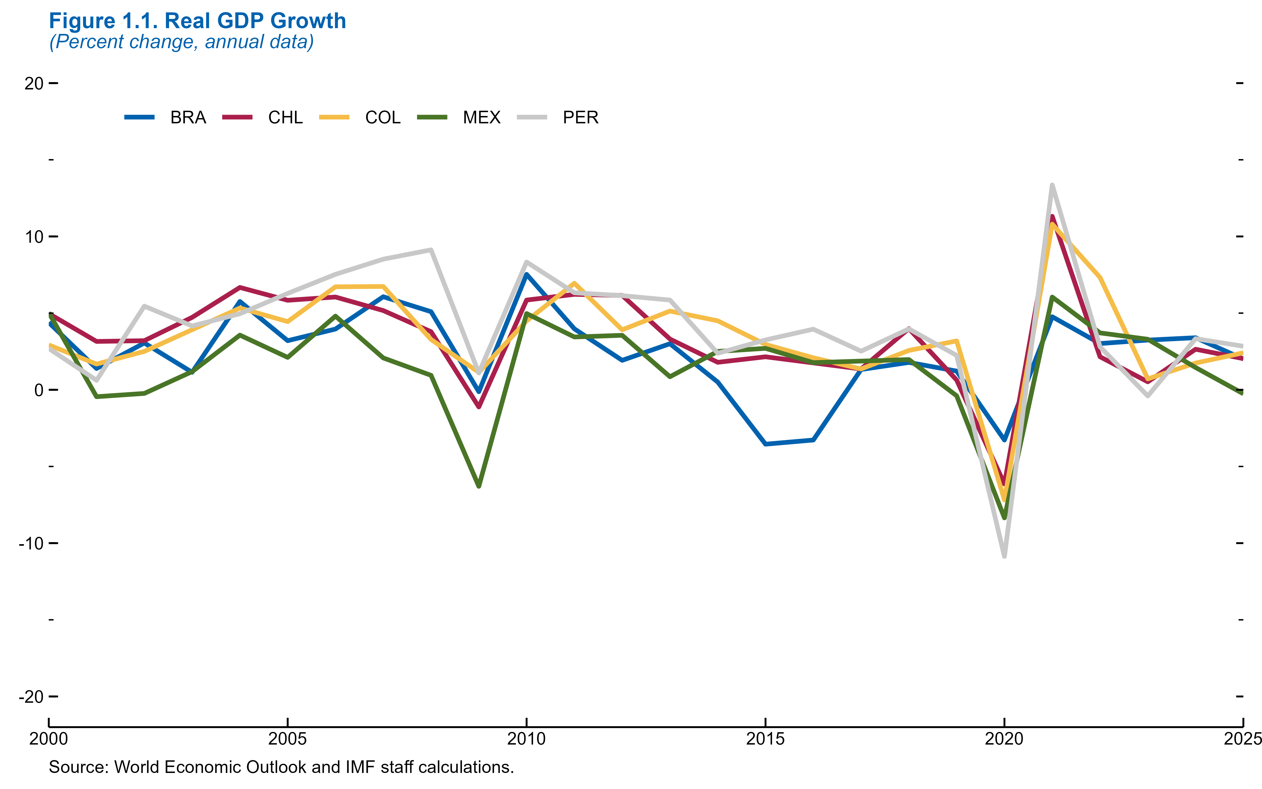
plot_yoy_ggr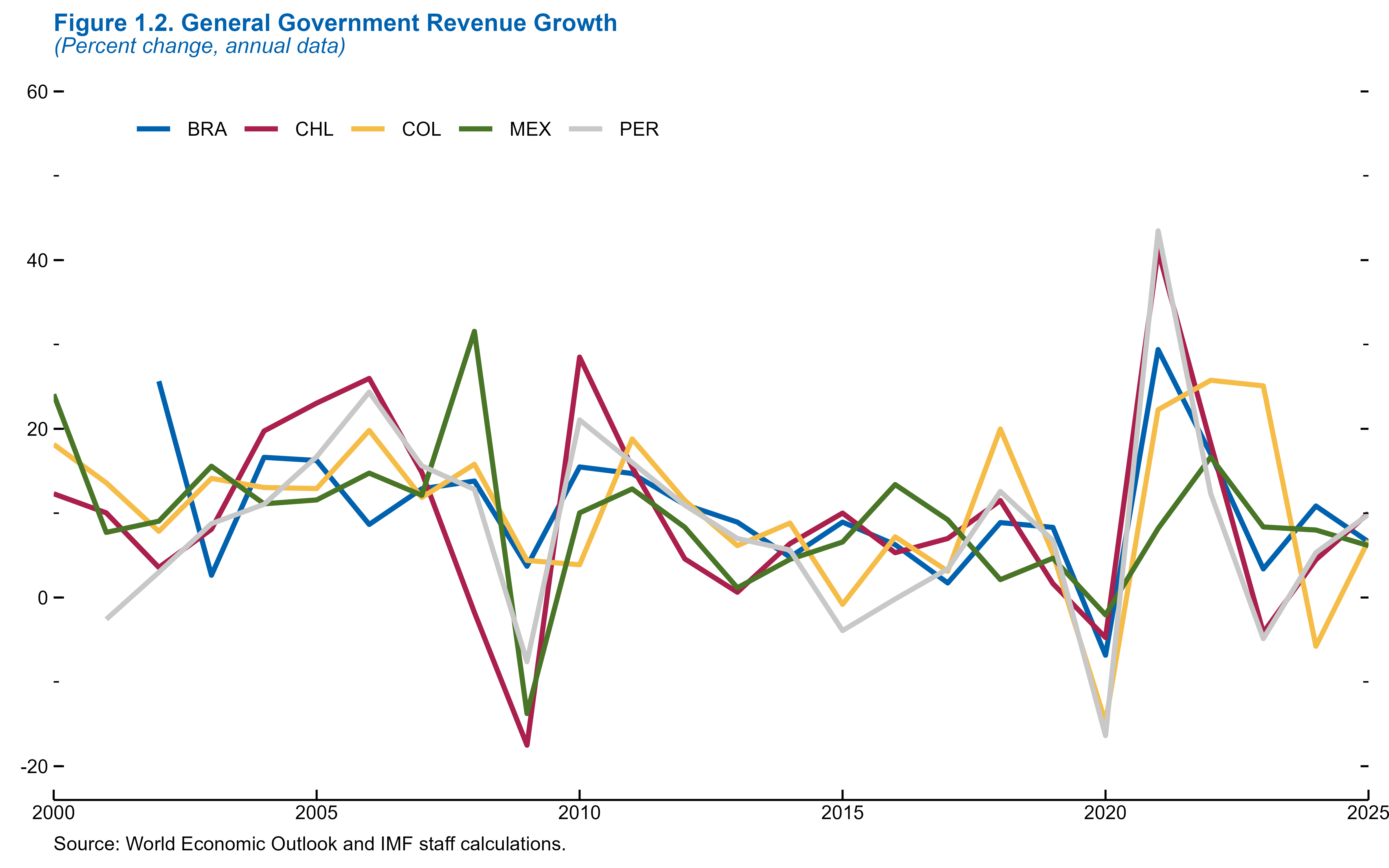
Creating a Panel
As we saw in the WEO section, the panels are stacked vertically in one column in the publication. This is an example of how would be able to do that below.
# Apply formatting and remove captions
plot_yoy_real_gdp <- plot_yoy_real_gdp +
  scale_x_continuous(breaks = seq(2000, 2025, 5), expand = c(0, 0)) +
  labs(caption = NULL) +
  theme_weo_panel()

plot_yoy_ggr <- plot_yoy_ggr +
  scale_x_continuous(breaks = seq(2000, 2025, 5), expand = c(0, 0)) +
  labs(caption = NULL) +
  theme_weo_panel()

# Create combined panel plot
weo_panel <- plot_yoy_real_gdp / plot_yoy_ggr +
  plot_annotation(
    title = "Figure 1. Year-on-Year Changes in Economic Indicators",
    subtitle = "(2000–2025)",
    caption = "Sources: WEO data and IMF staff calculations.",
    theme = theme_weo() +
      theme(
        plot.subtitle = element_text(margin = margin(t = -5, b = 0)),
        plot.title = element_text(margin = margin(b = 8))
      )
  )

# Display
weo_panel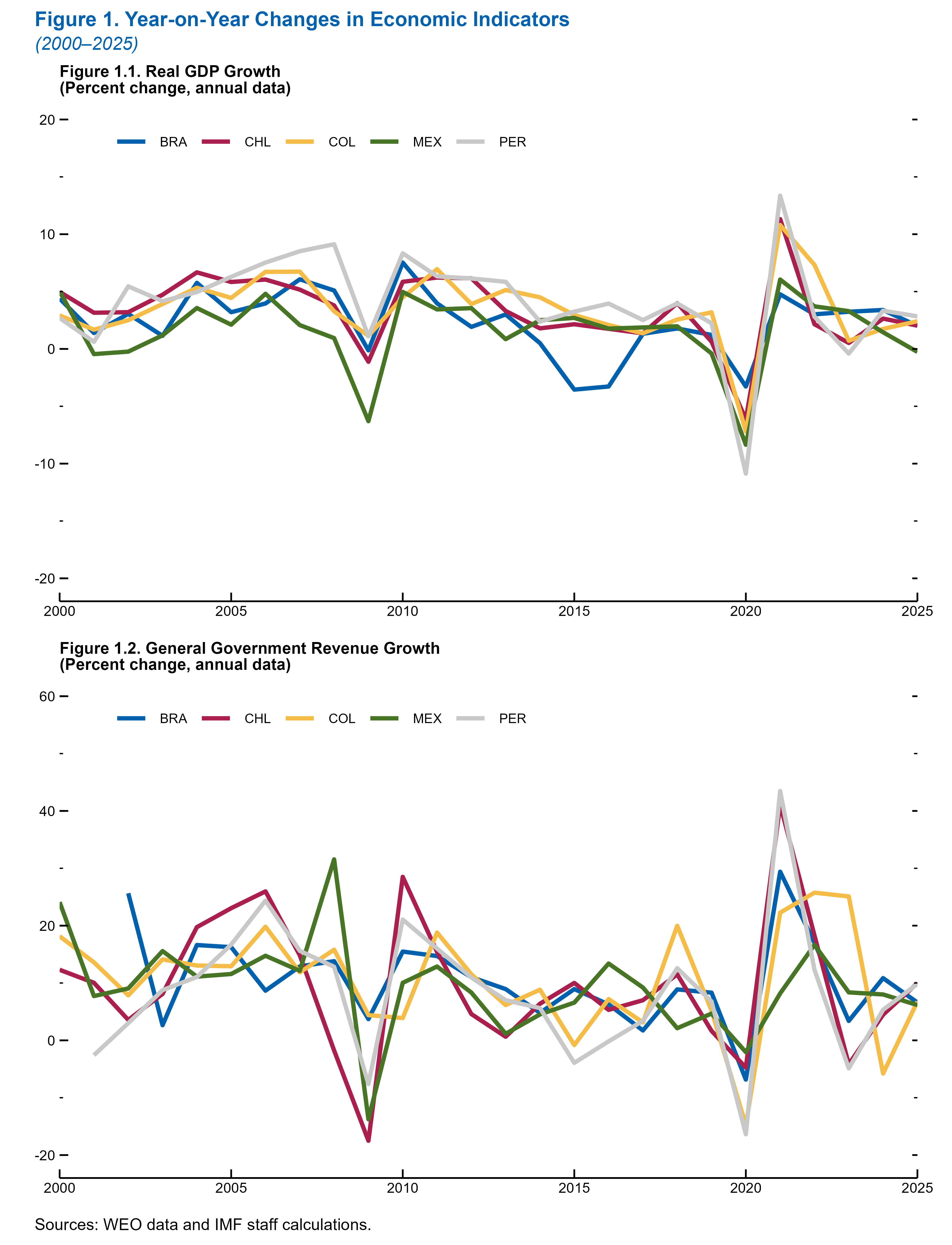
Changing your theme
Now, let’s switch to the traditional IMF theme. The charts and data will remain the same, but the styling would change.
To switch from a WEO-style chart to an IMF institutional style chart, only a few small changes to the code are required.
First, ensure the respective IMF theme is loaded, and replace the WEO theme function theme_weo() with theme_imf() (or theme_imf_panel() for multi-chart panels).
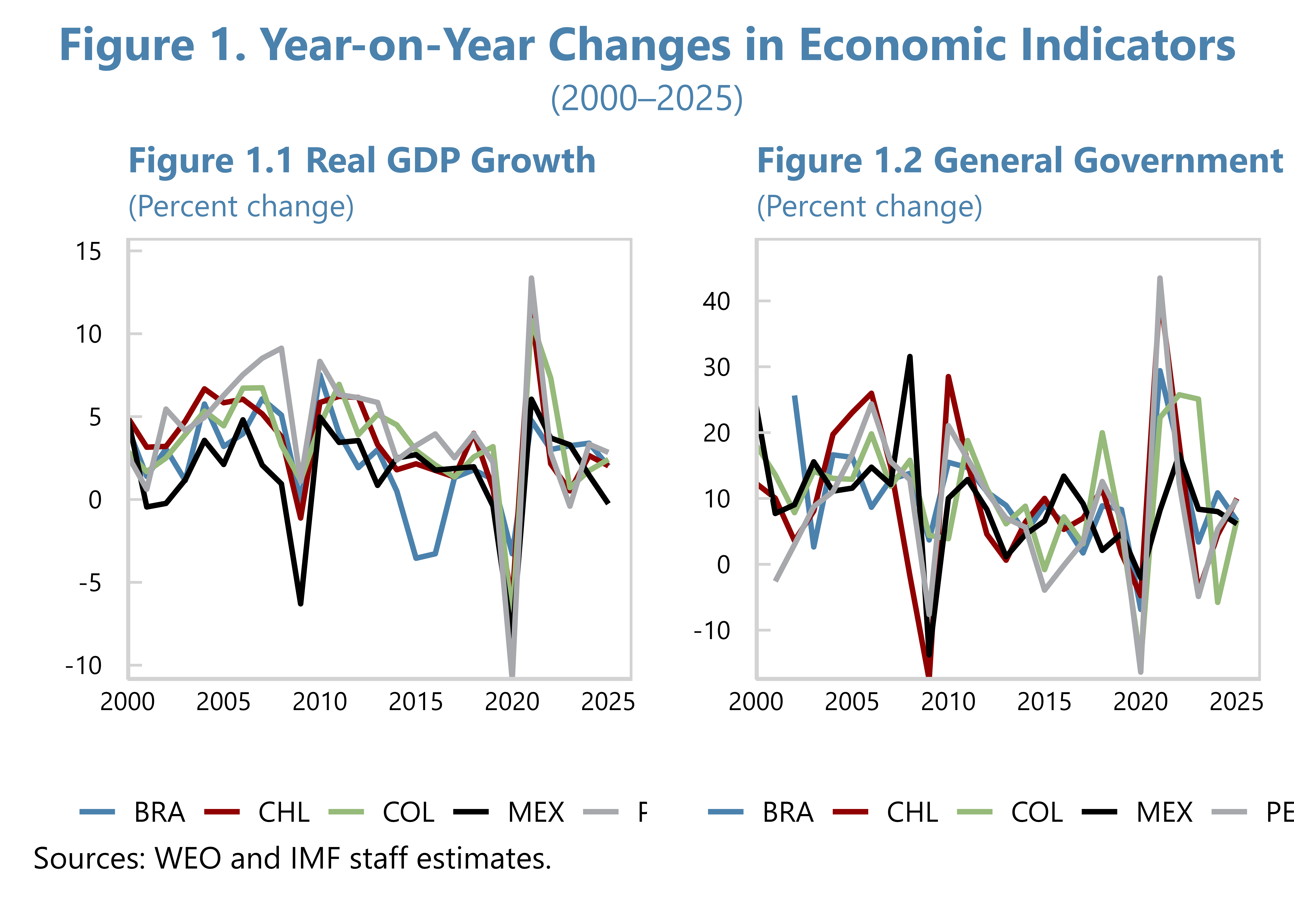
Second, update the color scale from scale_color_manual(values = weo_colors[1:5]) to a different color palette, such as scale_color_manual(values = c(blue, red, green, orange, purple)), which uses predefined IMF colors in your IMF utility script.
You should also remove any add_y_ticks() lines, as IMF themes handle ticks and axis lines internally.
Let’s look at how we would do this in the same charts below.
#Add IMF theme and color definitions
source(here("utils/theme_and_colors_IMF.R"))

# Real GDP Growth Chart with Legend Below
plot_yoy_real_gdp <- ggplot(weo_filtered, aes(x = Year, y = YoY_Real_GDP, color = Country, group = Country)) +
  geom_line(linewidth = 1) +
  scale_x_continuous(
    breaks = seq(x_min, x_max, 5),
    expand = expansion(mult = c(0, 0.05))
  ) +
  scale_y_continuous(
    breaks = scales::extended_breaks(n = 6),
    expand = expansion(mult = c(0, 0.1))
  ) +
  scale_color_manual(values = c(blue, dark_red, green, black, grey)) +
  labs(
    title = "Figure 1.1 Real GDP Growth",
    subtitle = "(Percent change)",
    color = NULL,
    x = "", y = ""
  ) +
  theme_imf() +
  theme(
    legend.position = "bottom",
    legend.title = element_blank()
  )

# GGR Chart with Legend Below
plot_yoy_ggr <- ggplot(weo_filtered, aes(x = Year, y = YoY_GGR, color = Country, group = Country)) +
  geom_line(linewidth = 1) +
  scale_x_continuous(
    breaks = seq(x_min, x_max, 5),
    expand = expansion(mult = c(0, 0.05))
  ) +
  scale_y_continuous(
    breaks = scales::extended_breaks(n = 6),
    expand = expansion(mult = c(0, 0.1))
  ) +
  scale_color_manual(values = c(blue, dark_red, green, black, grey)) +
  labs(
    title = "Figure 1.2 General Government Revenue Growth",
    subtitle = "(Percent change)",
    color = NULL,
    x = "", y = ""
  ) +
  theme_imf() +
  theme(
    legend.position = "bottom",
    legend.title = element_blank()
  )

# Display each plot
plot_yoy_real_gdp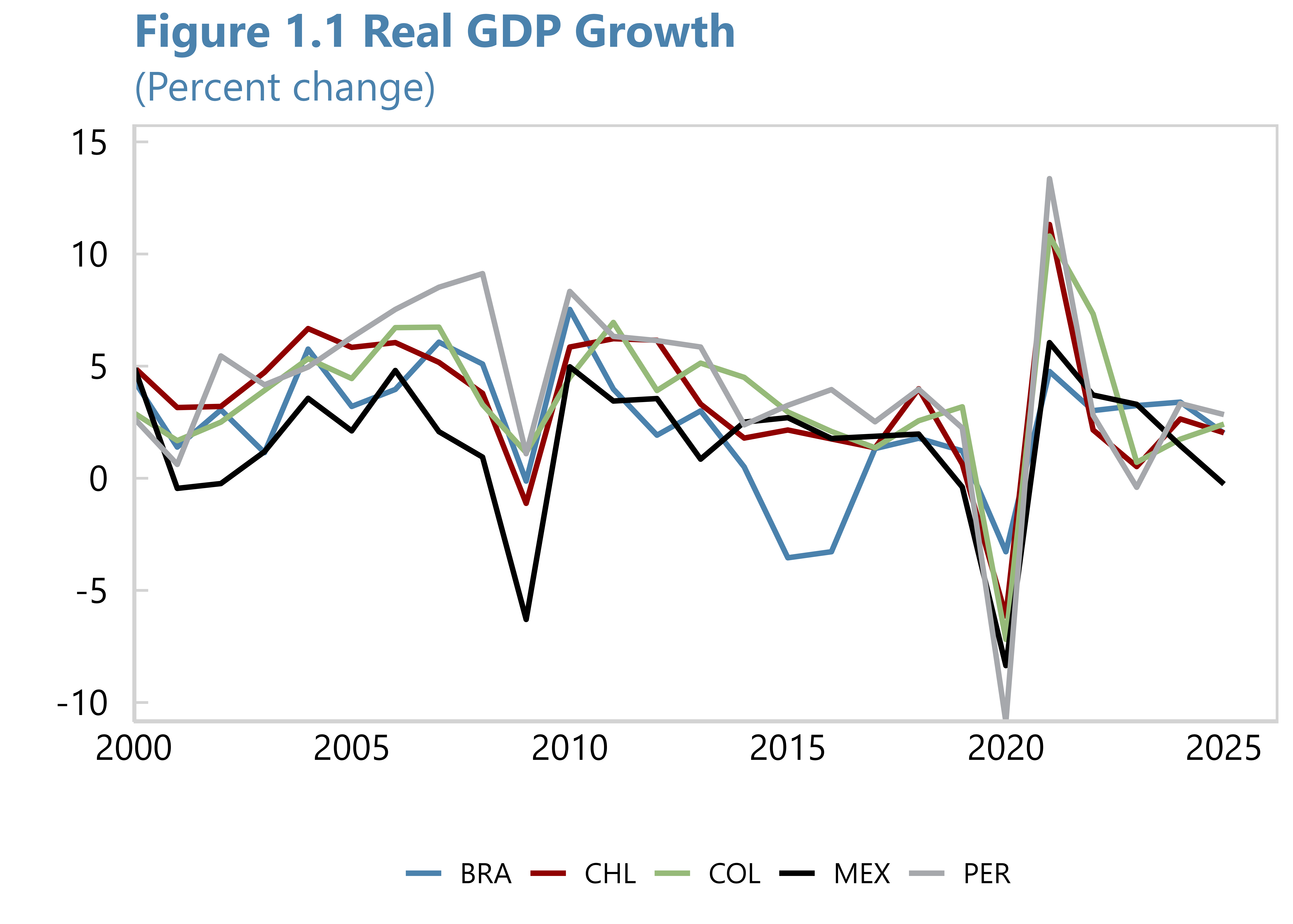
plot_yoy_ggr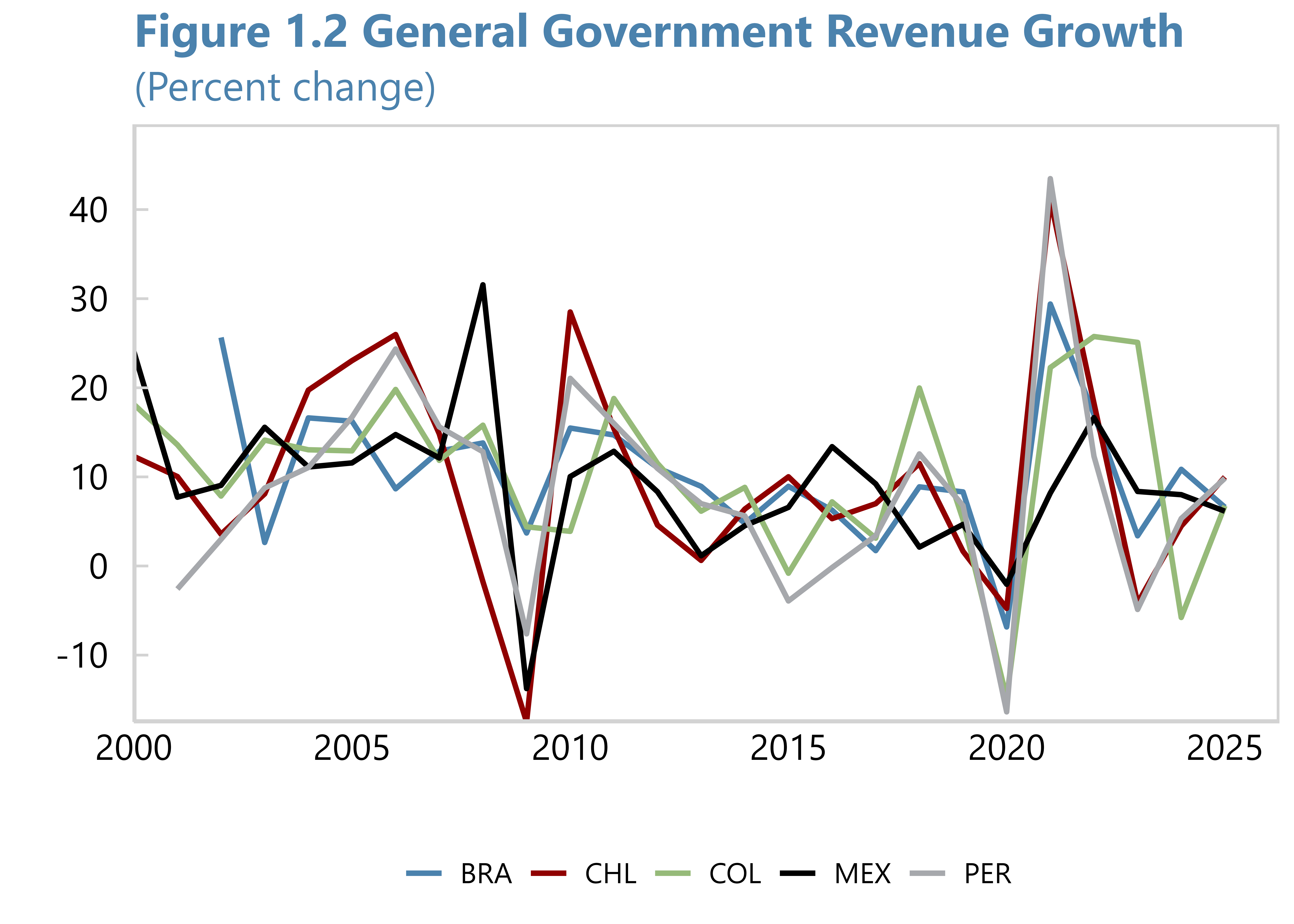
This process would be very similar for a panel chart. We would just use the theme_imf_panel() and apply this to both the individual plots and the combined figure.
# Combine plots with panel-specific theme and shared legend at bottom
patchwork_panel <- (plot_yoy_real_gdp + plot_yoy_ggr) &
  theme_imf_panel() &  # Force both charts to use panel styling
  theme(legend.position = "bottom")

# Annotate and apply overall panel styling
imf_panel <- patchwork_panel + plot_annotation(
  title = "Figure 1. Year-on-Year Changes in Economic Indicators",
  subtitle = "(2000–2025)",
  caption = "Sources: WEO and IMF staff estimates.",
  theme = theme_imf_panel() +  # Apply global panel style for the figure
    theme(
      plot.title = element_text(
        color = blue,
        family = primary_font,
        face = "bold",
        size = 18,
        hjust = 0.5
      ),
      plot.subtitle = element_text(
        color = blue,
        family = primary_font,
        face = "plain",
        size = 14,
        hjust = 0.5
      ),
      plot.caption = element_text(
        hjust = 0,
        size = 12,
        family = primary_font
      ),
      plot.margin = margin(0.75, 0.5, 0.5, 0.5, "lines")
    )
)

# Display the panel
imf_panel