install.packages("devtools")
library(devtools)Creating a WEO-style Formatted Chart using iData
This section introduces the IMF WEO theme and provides an example by importing WEO data from iData, performing some basic analysis on these indicators, and creating a panel chart.
Setting Up Your Environment
If you have completed the prior iData section, you can skip this set up section.
If you have not completed the prior iData section, you first need to the install the rsdmx package. You cannot install it the usual way. To be able to access imfdata you need to install the latest version from Github. Before you can install it, you first need to load (or install) the devtools package.
You then can install the rsdmx package from Github. Please note the force=TRUE argument, which helps prevent installation problems.
install_github("opensdmx/rsdmx", force = TRUE)Next, you must load several packages packages and also the imf_data_utils script that we created to read iData.
library(rsdmx)
library(AzureAuth)
library(tidyverse)
── Attaching core tidyverse packages ──────────────────────── tidyverse 2.0.0 ──
✔ dplyr 1.1.4 ✔ readr 2.1.5
✔ forcats 1.0.0 ✔ stringr 1.5.1
✔ ggplot2 3.5.1 ✔ tibble 3.2.1
✔ lubridate 1.9.3 ✔ tidyr 1.3.1
✔ purrr 1.0.2
── Conflicts ────────────────────────────────────────── tidyverse_conflicts() ──
✖ dplyr::filter() masks stats::filter()
✖ dplyr::lag() masks stats::lag()
ℹ Use the conflicted package (<http://conflicted.r-lib.org/>) to force all conflicts to become errorslibrary(lubridate)
library(here)here() starts at C:/IMF-R-Booklibrary(patchwork)
library(ggplot2)
source(here("utils/imf_data_utils.R")) Loading the WEO theme
We are also going to load a new utils script, which is our IMF WEO theme. Since this has been added later, make sure you have copy pasted this file into your respective Utils folder from the shared location.
source(here("utils/theme_and_colors_WEO.R"))
Attaching package: 'gridExtra'The following object is masked from 'package:dplyr':
combineImporting Public WEO data
To start, we will need to retrieve data as part of our workflow. Let’s retrieve annual unemployment rates (LUR) and real GDP (NGDP_R) for LA5 countries: Brazil, Chile, Colombia, Mexico, and Peru.
# Download data from WEO database
weo_data <- imfdata_by_countries_and_series(
  department = "RES",
  dataset = "WEO",
  countries = c("BRA", "CHL", "COL", "MEX", "PER"),
  series = c("LUR", "NGDP_R"),
  frequency = "A"
)
[rsdmx][INFO] Fetching 'https://api.imf.org/external/sdmx/2.1/data/IMF.RES,WEO/BRA+CHL+COL+MEX+PER.LUR+NGDP_R.A/all/' # View structure of the data
str(weo_data)'data.frame': 499 obs. of 11 variables:
$ COUNTRY : chr "BRA" "BRA" "BRA" "BRA" ...
$ INDICATOR : chr "LUR" "LUR" "LUR" "LUR" ...
$ FREQUENCY : chr "A" "A" "A" "A" ...
$ COUNTRY_UPDATE_DATE: chr "9/13/2025" "9/13/2025" "9/13/2025" "9/13/2025" ...
$ OVERLAP : chr "OL" "OL" "OL" "OL" ...
$ DECIMALS_DISPLAYED : chr "3" "3" "3" "3" ...
$ SCALE : chr "0" "0" "0" "0" ...
$ TIME_PERIOD : chr "1991" "1992" "1993" "1994" ...
$ OBS_VALUE : chr "6.366" "6.42" "6.03" "6.47" ...
$ date : num 1991 1992 1993 1994 1995 ...
$ value : num 6.37 6.42 6.03 6.47 7.09 ...If you want to access a restricted dataset you need to add the needs_auth=T argument to the function, and adjust the dataset to the restricted one, i.e., WEO_LIVE. You will be asked to login (or if you done that in the past hour, it will get a token from cache).
Clean and Reshape Data
As we have discussed earlier in the book, we must reshape the data to a wide format for easier analysis.
# Clean and reshape data
weo_clean <- weo_data %>%
  # Filter relevant columns
  select(COUNTRY, INDICATOR, TIME_PERIOD, OBS_VALUE) %>%
  # Rename columns for better readability
  rename(
    Country = COUNTRY,
    Indicator = INDICATOR,
    Year = TIME_PERIOD,
    Value = OBS_VALUE
  ) %>%
  # Pivot wider to have one column for each indicator
  pivot_wider(names_from = Indicator, values_from = Value)

# Preview the cleaned data
head(weo_clean)
# A tibble: 6 × 4
Country Year LUR NGDP_R
<chr> <chr> <chr> <chr>
1 BRA 1991 6.366 616155000000
2 BRA 1992 6.42 613279000000
3 BRA 1993 6.03 641888000000
4 BRA 1994 6.47 676129000000
5 BRA 1995 7.09 705992000000
6 BRA 1996 8.03 721586000000Basic Data Analysis
In our charts, we would prefer to show year-on-year changes of our indicators, so lets perform that calculation now.
# Convert LUR and NGDP_R to numeric and calculate YoY changes
weo_clean <- weo_clean %>%
  arrange(Country, Year) %>%
  mutate(
    LUR = as.numeric(LUR),
    NGDP_R = as.numeric(NGDP_R)
  ) %>%
  group_by(Country) %>%
  mutate(
    YoY_Unemployment = (LUR - lag(LUR)),
    YoY_Real_GDP = (NGDP_R / lag(NGDP_R) - 1) * 100
  ) %>%
  ungroup()

# Preview data with YoY calculations
head(weo_clean)
# A tibble: 6 × 6
Country Year LUR NGDP_R YoY_Unemployment YoY_Real_GDP
<chr> <chr> <dbl> <dbl> <dbl> <dbl>
1 BRA 1980 NA 522938000000 NA NA
2 BRA 1981 NA 499930000000 NA -4.40
3 BRA 1982 NA 502908000000 NA 0.596
4 BRA 1983 NA 485809000000 NA -3.40
5 BRA 1984 NA 511592000000 NA 5.31
6 BRA 1985 NA 552012000000 NA 7.90 Plotting your Data
Now let’s visualize our year-on-year changes by creating two line charts in our WEO theme, one on real GDP and one on unemployment, with most recently published WEO data. We are also going to limit our charts to only show the years 2000-2025.
## Visualization of YOY Changes

#Filtet 2000-2025
weo_filtered <- weo_clean %>%
  filter(Year >= 2000 & Year <= 2025)
weo_filtered$Year <- as.numeric(weo_filtered$Year)

# Define X axis range
x_min <- 2000
x_max <- 2025

# Determine GDP breaks from data
breaks_gdp <- generate_breaks_auto(weo_filtered$YoY_Real_GDP)

# Determine Unemployment breaks from data
breaks_unemp <- generate_breaks_auto(weo_filtered$YoY_Unemployment)

# GDP plot
plot_yoy_real_gdp <- ggplot(weo_filtered, aes(x = Year, y = YoY_Real_GDP, color = Country, group = Country)) +
  geom_line(size = 1) +
  scale_x_continuous(breaks = seq(x_min, x_max, 5), expand = c(0, 0)) +
  scale_y_continuous(breaks = breaks_gdp$major, limits = breaks_gdp$limits) +
  add_y_ticks(
    major_breaks = breaks_gdp$major,
    minor_breaks = breaks_gdp$minor,
    x_min = x_min,
    x_max = x_max
  ) +
  scale_color_manual(values = weo_colors[1:5]) +
  labs(
    title = "Figure 1.1.  Real GDP Growth",
    subtitle = "(Percent change, annual data)",
    color = "Country",
    caption = "Source: World Economic Outlook and IMF staff calculations."
  ) +
  theme_weo()

# Unemployment plot
plot_yoy_unemployment <- ggplot(weo_filtered, aes(x = Year, y = YoY_Unemployment, color = Country, group = Country)) +
  geom_line(size = 1) +
  scale_x_continuous(breaks = seq(x_min, x_max, 5), expand = c(0, 0)) +
  scale_y_continuous(breaks = breaks_unemp$major, limits = breaks_unemp$limits) +
  add_y_ticks(
    major_breaks = breaks_unemp$major,
    minor_breaks = breaks_unemp$minor,
    x_min = x_min,
    x_max = x_max
  ) +
  scale_color_manual(values = weo_colors[1:5]) +
  labs(
    title = "Figure 1.2.  Unemployment Rate Change",
    subtitle = "(Percentage point change, annual data)",
    color = "Country",
    caption = "Source: World Economic Outlook and IMF staff calculations."
  ) +
  theme_weo()

# Display both plots
plot_yoy_real_gdp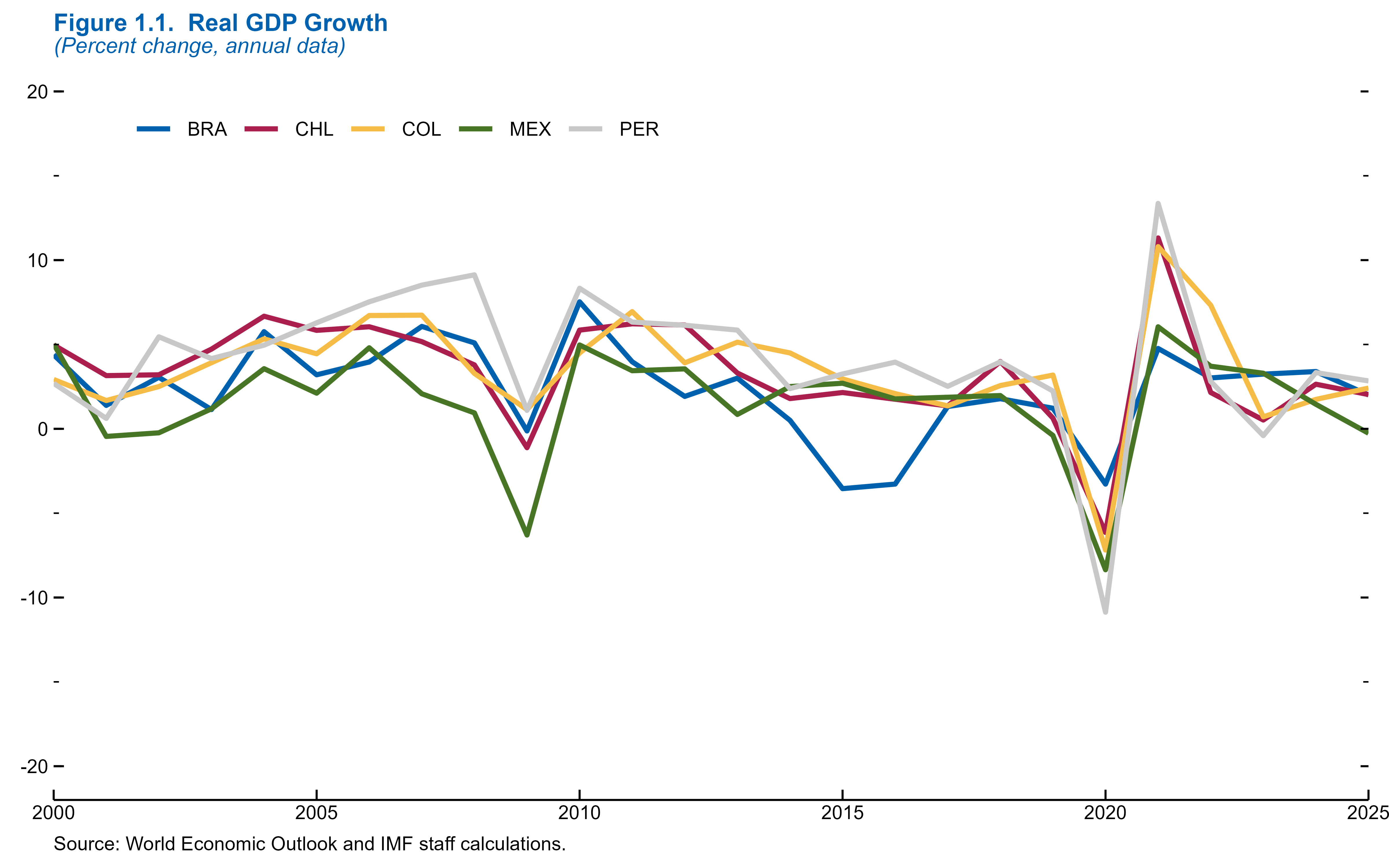
plot_yoy_unemployment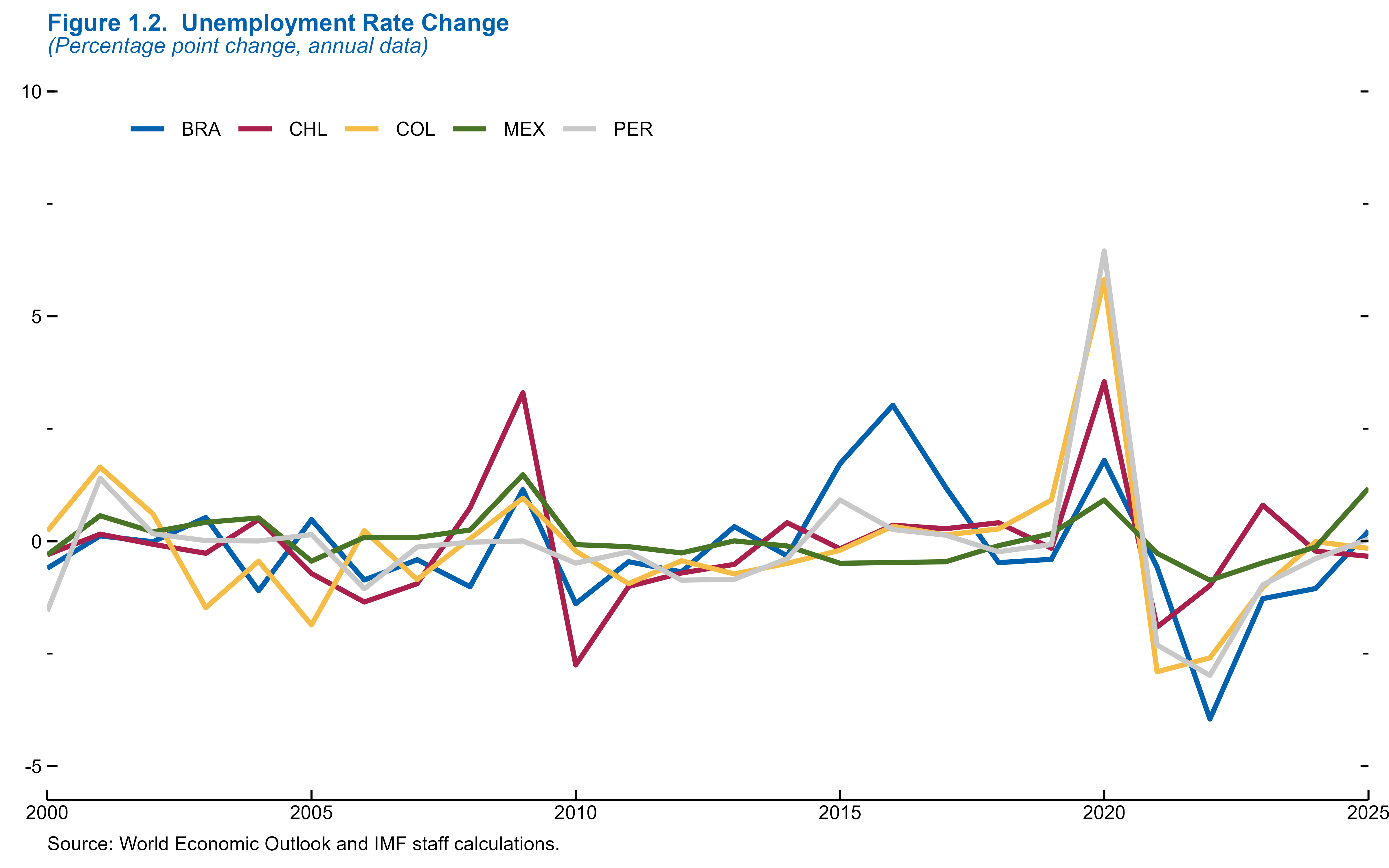
Creating a Panel
In a more traditional styled WEO panel, the panels are stacked vertically in one column in the publication. This is an example of how would be able to do that below.
# Apply formatting and remove captions
plot_yoy_real_gdp <- plot_yoy_real_gdp +
  scale_x_continuous(breaks = seq(2000, 2025, 5), expand = c(0, 0)) +
  labs(caption = NULL) +
  theme_weo_panel()

plot_yoy_unemployment <- plot_yoy_unemployment +
  scale_x_continuous(breaks = seq(2000, 2025, 5), expand = c(0, 0)) +
  labs(caption = NULL) +
  theme_weo_panel()

imf_panel <- plot_yoy_real_gdp / plot_yoy_unemployment +
  plot_annotation(
    title = "Figure 1. Year-on-Year Changes in Economic Indicators",
    subtitle = "(2000–2025)",
    caption = "Sources: WEO data and IMF staff calculations.",
    theme = theme_weo() +
      theme(plot.subtitle = element_text(margin = margin(t = -5, b = 0)),
            plot.title = element_text(margin = margin(b=8)))
  )

imf_panel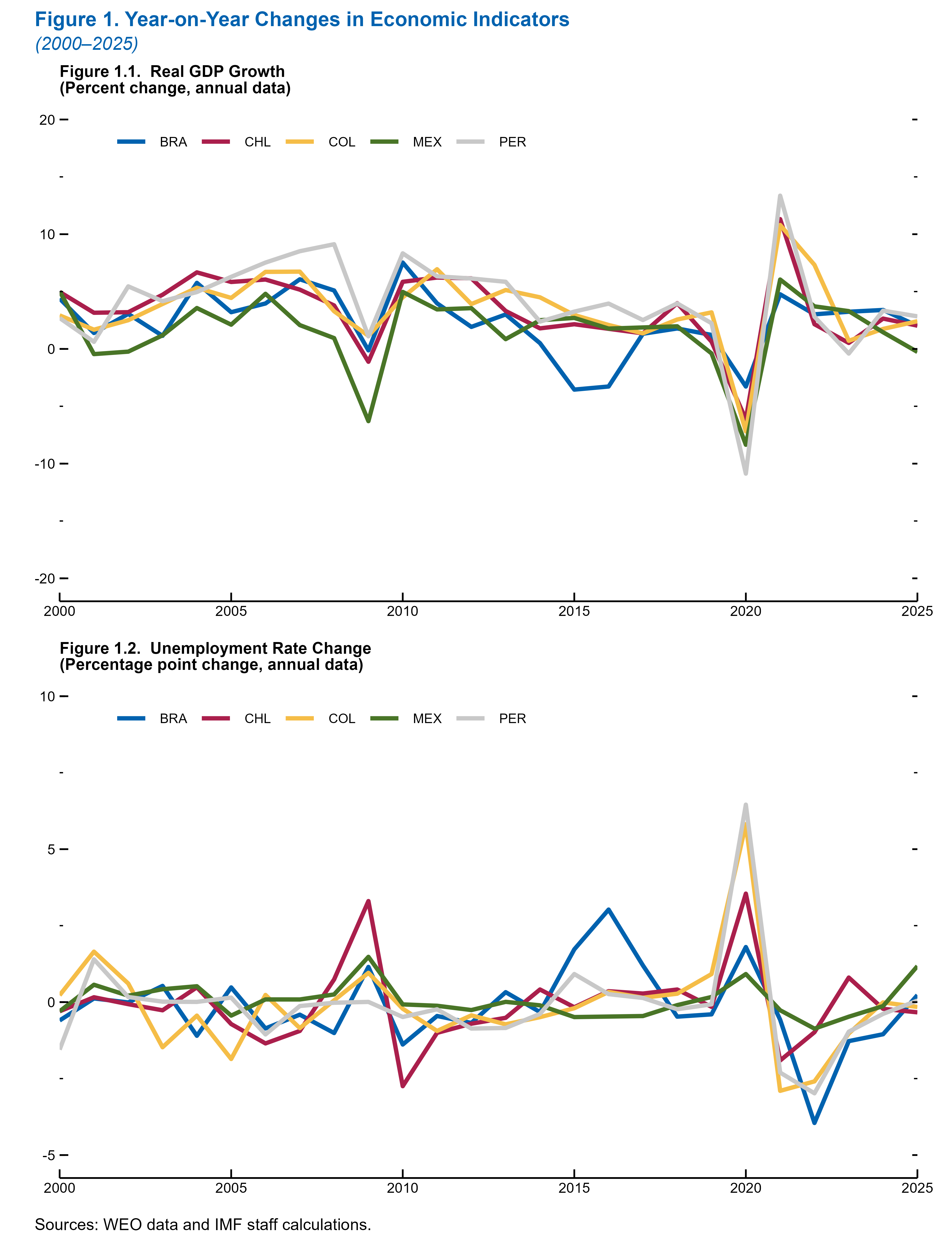
Another common occurrence in a WEO styled chart is the shading of the forecast period. Let’s assume that the forecast period in this case is 2024 to 2025. We can use the function add forecast shading to add this shading to the period.
# Add forecast shading to both plots
plot_yoy_real_gdp <- add_forecast_shading(plot_yoy_real_gdp, start_year = 2024, end_year = 2025)

plot_yoy_unemployment <- add_forecast_shading(plot_yoy_unemployment, start_year = 2024, end_year = 2025)
# Remove any per-plot captions
plot_yoy_real_gdp <- plot_yoy_real_gdp +
  scale_x_continuous(breaks = seq(2000, 2025, 5), expand = c(0, 0)) +
  labs(caption = NULL)

plot_yoy_unemployment <- plot_yoy_unemployment +
  scale_x_continuous(breaks = seq(2000, 2025, 5), expand = c(0, 0)) +
  labs(caption = NULL)

# Combine the plots vertically with unified annotation
imf_panel <- plot_yoy_real_gdp / plot_yoy_unemployment +
  plot_annotation(
    title = "Figure 1. Year-on-Year Changes in Economic Indicators",
    subtitle = "(2000–2025)",
    caption = "Sources: WEO data and IMF staff calculations.",
    theme = theme_weo() +
      theme(
        plot.subtitle = element_text(margin = margin(t = -5, b = 0)),
        plot.title = element_text(margin = margin(b = 8))
      )
  )

imf_panel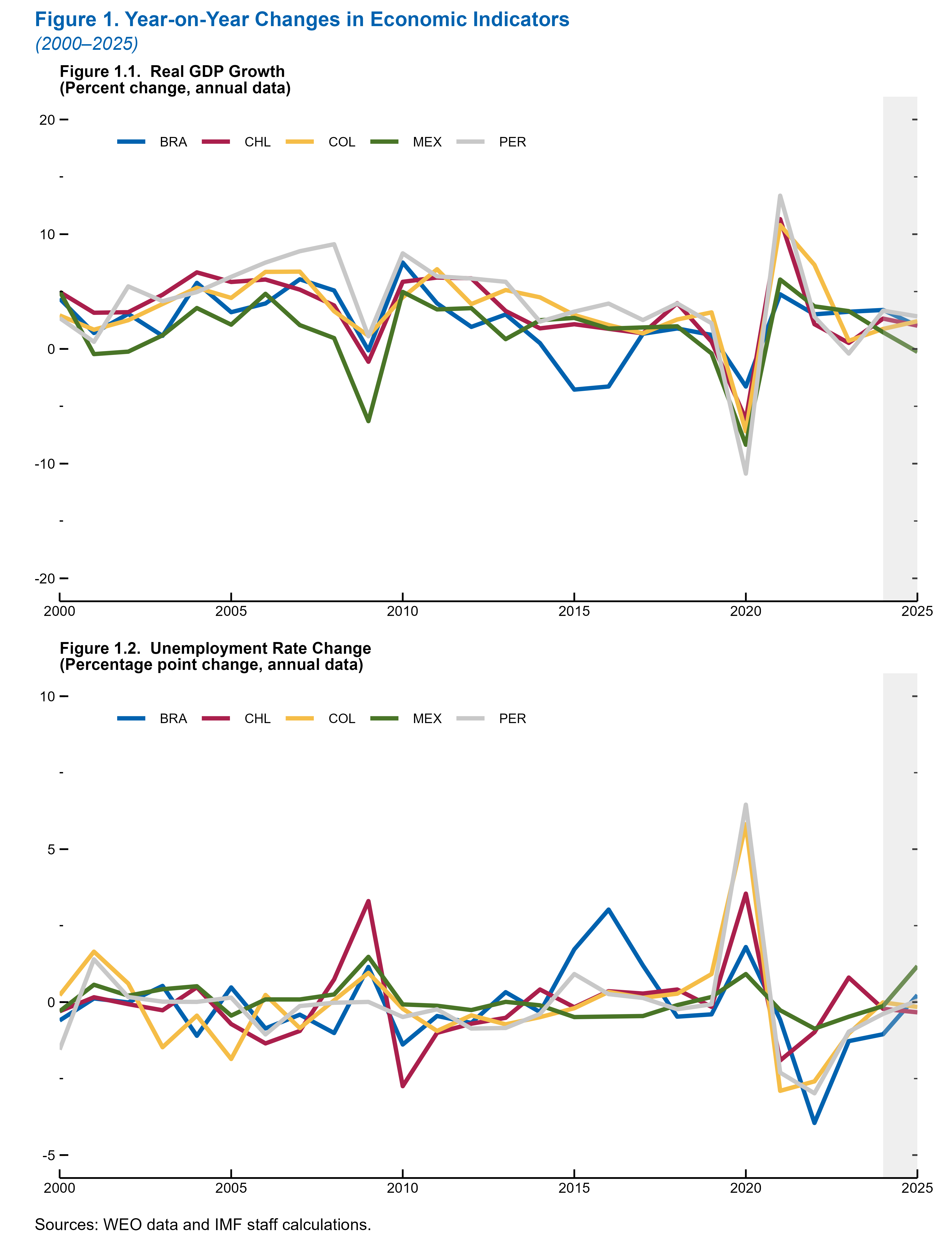
WEO-Style Bar Chart
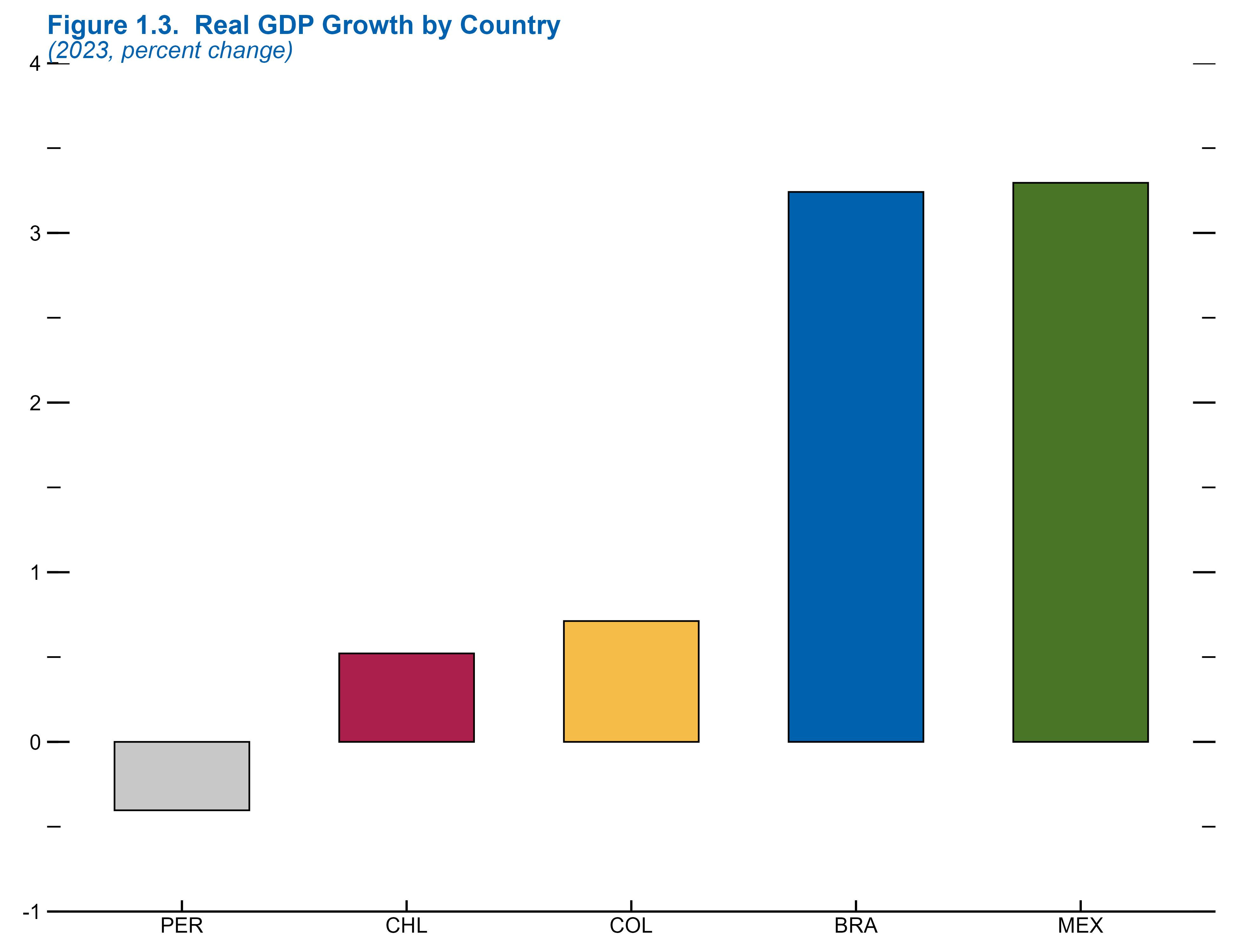
In addition to line charts, bar charts are commonly used in publications. Let’s briefly look at an example of a WEO-formatted bar chart that shows real GDP growth for LA5 for 2023.
# Example: Bar chart for 2023 Real GDP Growth by Country
weo_bar <- weo_filtered %>%
  filter(Year == 2023)

# Generate breaks for Y axis
breaks_bar <- generate_breaks_auto(weo_bar$YoY_Real_GDP)

# Create chart
ggplot(weo_bar, aes(x = reorder(Country, YoY_Real_GDP), y = YoY_Real_GDP, fill = Country)) +
  geom_col(width = 0.6, color = "black", linewidth = 0.3) +
  scale_y_continuous(
    breaks = breaks_bar$major,
    limits = breaks_bar$limits,
    expand = c(0, 0)
  ) +
  add_y_ticks(
    major_breaks = breaks_bar$major,
    minor_breaks = breaks_bar$minor,
    x_min = 0.4,
    x_max = length(unique(weo_bar$Country)) + 0.6,
    style = "bar"  # <- ensures tick lengths are scaled correctly
  ) +
  scale_fill_manual(values = weo_colors[1:5]) +
  labs(
    title = "Figure 1.3.  Real GDP Growth by Country",
    subtitle = "(2023, percent change)",
    x = NULL,
    y = "Real GDP Growth (%)"
  ) +
  theme_weo() +
  theme(
    legend.position = "none",
    axis.text.x = element_text(angle = 0)
  )
Now you’ve seen how to create basic WEO-style charts using iData.