library(zoo)
library(here)
library(ragg)

# Define color schemes and line types
myColors <- c("#4B82AD", "red", "black", "green")
blue<-"#4B82AD"
myLT <- c(1, 3, 2, 4)Panel Charts without Text Annotation
This example shows how to make panel charts. In this example, we do not add text annotation (the narrative you see in charts in IMF staff reports). We will do that in the next section.
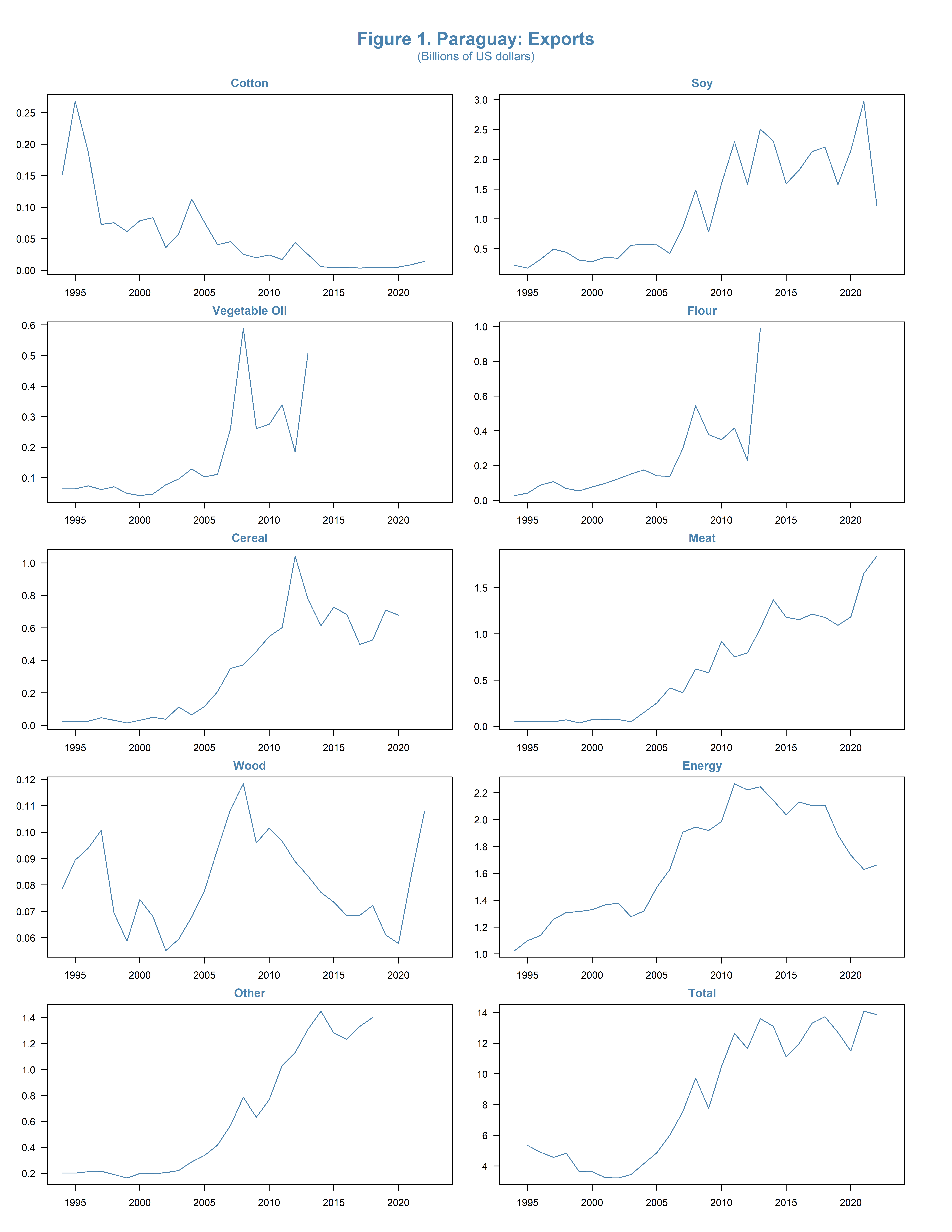
Panel Charts of Exports of Paraguay
We will make a panel chart of the various export categories of Paraguay. Instead of writing code for each chart, we will use a function.
Setup
First, we load the necessary libraries and define our color schemes and line types.
Read the Data
We first read the data, which we have stored in an rds file (which can be used to store a data frame on disk).
expvals <- readRDS(here("databases/expvals.rds"))
head(expvals)
year total cotton soy vegoil flour cereal meat wood
1 1994 NA 0.151425 0.222258 0.063433 0.027514 0.024468 0.055419 0.078696
2 1995 5.337184 0.268064 0.175922 0.063961 0.041103 0.026666 0.054861 0.089453
3 1996 4.903672 0.188145 0.324157 0.073724 0.088130 0.026139 0.046826 0.093939
4 1997 4.561457 0.072856 0.493598 0.061600 0.107283 0.048066 0.049202 0.100706
5 1998 4.836139 0.075420 0.440314 0.071049 0.068257 0.031943 0.069461 0.069418
6 1999 3.613722 0.061544 0.307135 0.049236 0.054254 0.015060 0.035395 0.058699
energy other
1 1.026389 0.204169
2 1.099882 0.202778
3 1.138525 0.212900
4 1.259231 0.217508
5 1.309547 0.190875
6 1.316006 0.164861Explanation:
The readRDS function reads the expvals data from an rds file located in the databases folder. The head function shows the first few rows of the data.
PlotValue Function
Define the plotValue function to create plots for each variable.
plotValue <- function(varcode, varname) {
  plot(expvals$year,expvals[, varcode], main = varname, col = blue, lty = myLT,
       family = "Segoe UI",type="l")
  abline(h = 100)
}
The plotValue function takes two arguments: varcode (the column name of the variable to plot) and varname (the title of the plot). It uses the plot.zoo function to create the plot and adds a horizontal line at 100 for reference.
Creating Plots
Now we generate the plots for various economic variables.
png(filename=here("figures/fig-paraguay-exports.png"), width = 8.5*1.25, res = 600,
    height = 11*1.25, units = "in")

# Graphical parameters
par(mar = c(2, 2, 2, 2))
par(oma = c(2, 2, 6, 2))
par(mfrow = c(5, 2))

# Font and colors settings
par(las = 1)
par(col.main = myColors[1])
par(col.axis = "black")
par(col.lab = "black")

# Plot each variable using plotValue
plotValue("cotton", "Cotton")
plotValue("soy", "Soy")
plotValue("vegoil", "Vegetable Oil")
plotValue("flour", "Flour")
plotValue("cereal", "Cereal")
plotValue("meat", "Meat")
plotValue("wood", "Wood")
plotValue("energy", "Energy")
plotValue("other", "Other")
plotValue("total", "Total")

# Main title and notes for the figure
titleString <- "Figure 1. Paraguay: Exports"
mtext(titleString, outer = TRUE, cex = 1.2, col = myColors[1], font = 2, line = 2)
mtext("(Billions of US dollars)", outer = TRUE, cex = 0.8, col = myColors[1], font = 1, line = 0.7)

dev.off()
agg_png
2 
Explanation of PNG Function and dev.off()
png(filename=here("figures/fig-paraguay-exports.png"), width = 8.5*1.5, res = 600, height = 11*1.5, units = "in"): This line sets up the PNG device for plotting. It specifies the file name and path where the plot will be saved, as well as the dimensions (width and height) and resolution (res) of the image.dev.off(): This function closes the current graphical device, which in this case is the PNG device. It finalizes and saves the image to the specified file. Without this call, the image file might not be properly saved.
Explanation
- Setting Up the Plot Area:
par(mar = c(2, 2, 2, 2)): Sets the margin sizes for the plot. The margins are specified in the order: bottom, left, top, and right.par(oma = c(2, 2, 6, 2)): Sets the outer margin sizes. These margins are around the entire plot area and are useful for adding titles and other annotations.par(mfrow = c(5, 2)): Creates a 5x2 layout for the plots, meaning there will be 5 rows and 2 columns of plots.
- Customizing Plot Appearance:
par(las = 1): Sets the orientation of the axis labels to always be horizontal.par(col.main = myColors[1]): Sets the color of the main title to the first color in themyColorsvector.par(col.axis = "black"): Sets the color of the axis text to black.par(col.lab = "black"): Sets the color of the axis labels to black.
- Plotting Each Variable:
plotValue("cotton", "Cotton"), etc.: Calls theplotValuefunction for each variable. This function creates a plot for the specified variable using the predefined colors and line types.
- Adding Titles and Notes:
mtextadds a main title and a note at the top of the plot area. Theouter = TRUEparameter places the text in the outer margin, which was set earlier usingpar(oma).titleString: Defines the main title for the figure.mtextwithcex = 1.2andfont = 2adjusts the size and font of the title. Theline = 2parameter positions the title slightly away from the plot area.- The second
mtextcall adds a subtitle or note with adjusted size (cex = 0.8), color (col = myColors[1]), and position (line = 0.7).
By following this tutorial, you can create a comprehensive panel chart for analyzing the export categories of Paraguay. This approach is efficient and allows for consistent styling across multiple plots. ```